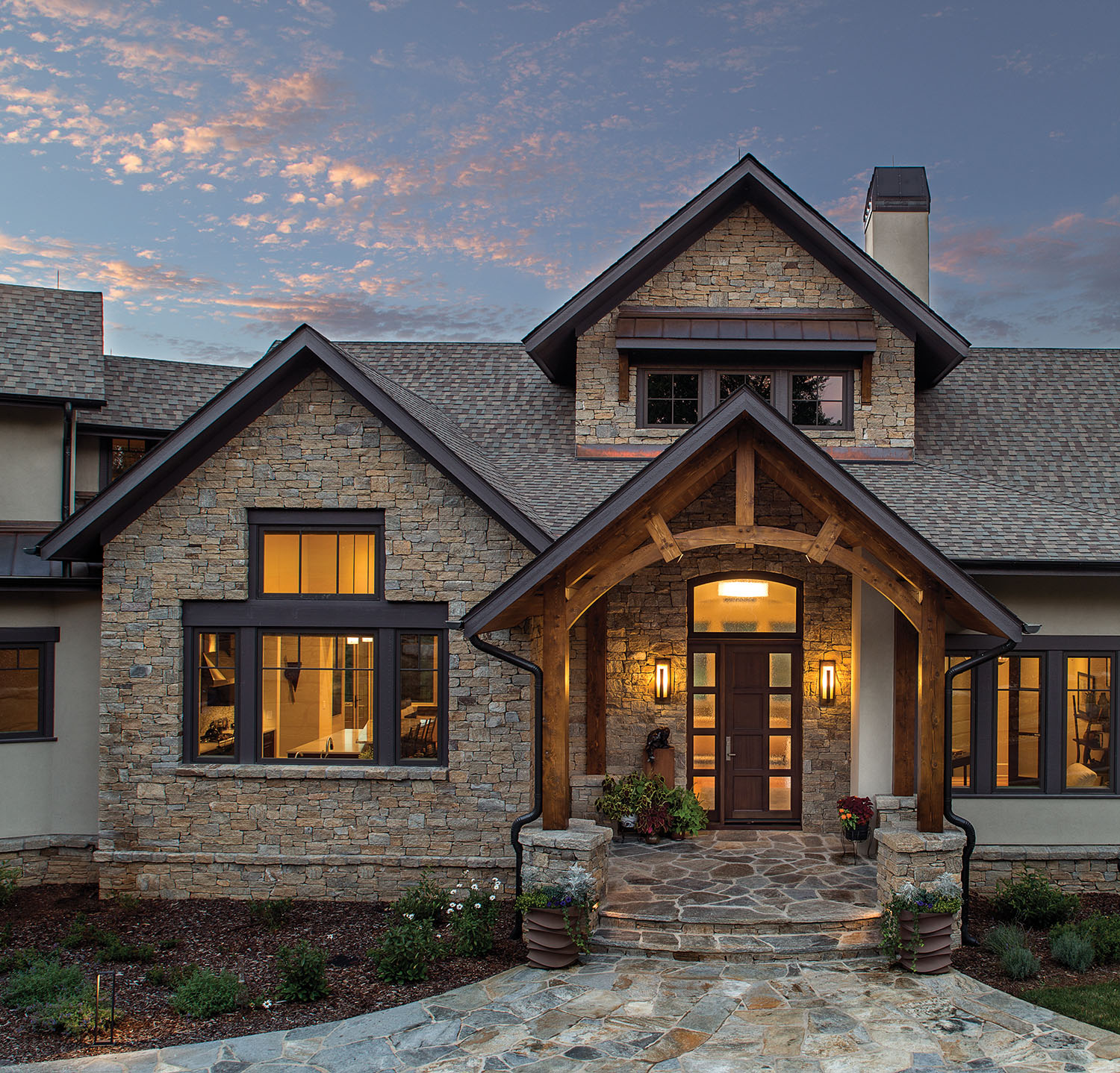
“There is no vanilla in this house,” says Sharon Allard of Allard & Roberts Interior Design. She’s referring to a Cliffs of Walnut Cove dwelling where no one room “reads” like another — or, for that matter, like any other room you’re likely to find.
Owner Robin Sipos envisioned the living areas, the kitchen/dining space, the five bedrooms, and the six baths with different patterns, fixtures, and lighting meant to create myriad distinct moods. And since she and her husband Wally were already knowledgable about interior design, every room was a blank slate of opportunity. It was a fun and fulfilling project.
“I loved every minute of it,” says Robin. “I loved every decision. I loved every change.”
Subtle but unifying, a lone design detail pulls the residence together: the curve. That shape complements every room in some way: curves in drawer pulls, on wall sconces, as part of a chair, a bank of windows, a wall, a fireplace, a shower. No fixture or structure was too small to incorporate a bend. The effect trends toward contemporary but never in an austere, post-Modern way: better to classify this house as an homage to the wave and the arch. The space earns a badge for warmth because of its artwork and high-contrasting colors.
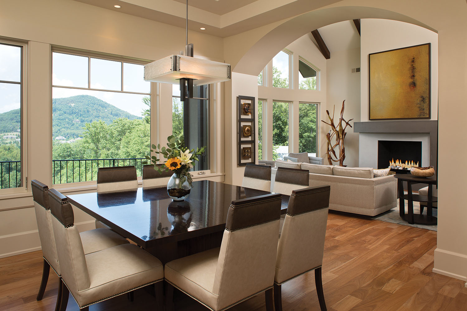
However, “we also knew the backgrounds were going to be neutral,” notes Talli Roberts, ASID, of Allard & Roberts. “Because when you walk in, you don’t want to take away from that view, that beautiful blue and green. Or, [in fall], that orange or gold or yellow.”
Allard & Roberts leaned into the challenging project. In one case, in search of the right material, they opened a new account with a tile-and-stone company that had no prior clients in the region, just to ensure the materials had no equal. “Robin didn’t want to walk into a showroom in Asheville and see the same thing we put in her house,” says Roberts.
“I Don’t Know How They Did It”
Robin says when she and Wally walk through the home now, they often repeat, “It just feels good.” Their affable, open manner comes across in the house’s easy flow and big features.
During the design phase, though, a substantial living-room fireplace presented the first major creative challenge. Robin showed Roberts and Allard pictures of what she wanted, and the two melded the various concepts into something new.
“She had two or three designs that she liked that we took for inspiration,” Roberts says. “We knew that she wanted something two-tone and that was really massive and appropriately scaled for that room.”
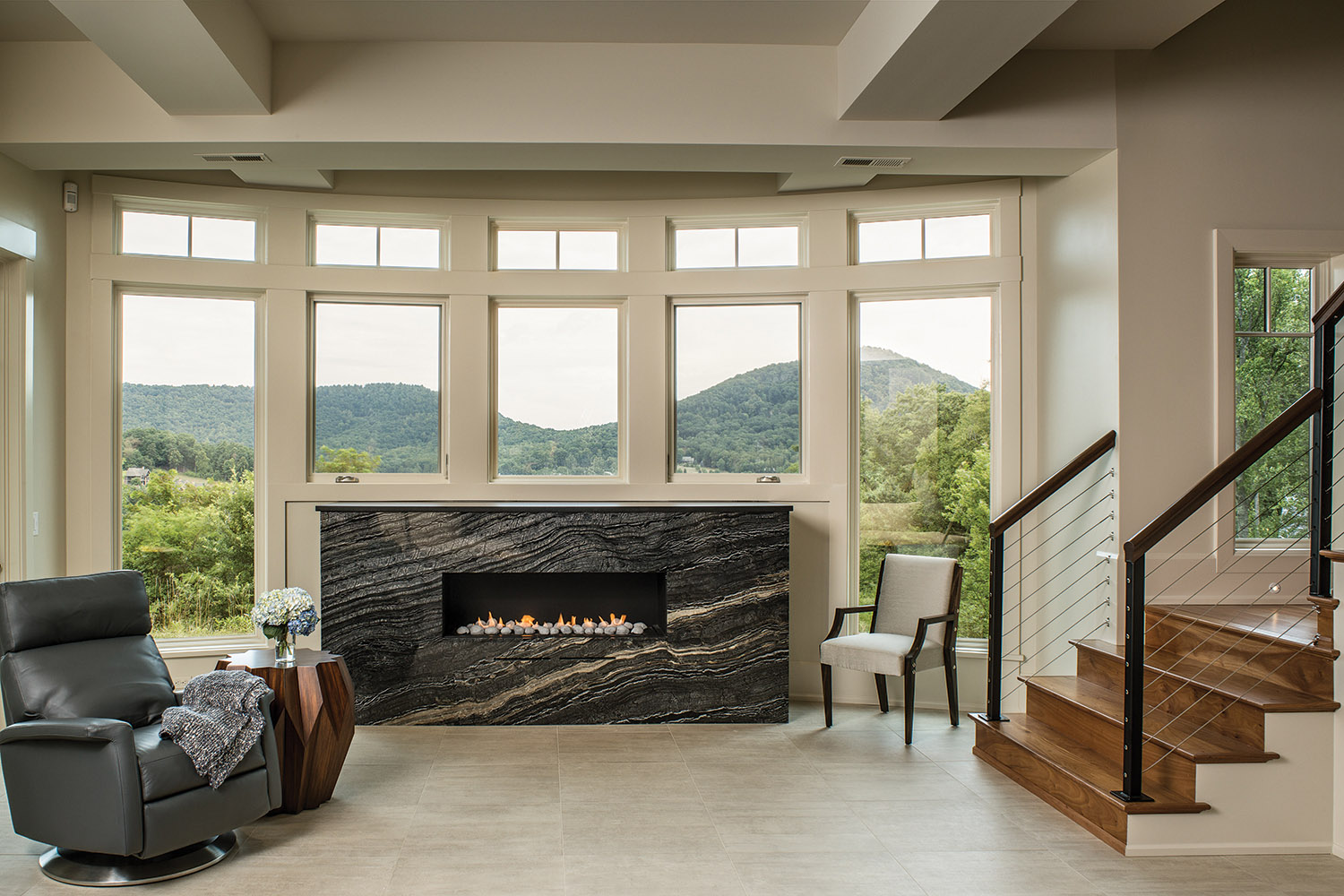
The formed concrete hearth and mantel took five sturdy men to install. Robin remembers that day because the men had to figure out how to turn the piece the right way, inside and outside the entrance, so that it faced the right direction the first time.
“I don’t know how they did it, but I was awed by the strength of these guys that carried it in here,” she says.
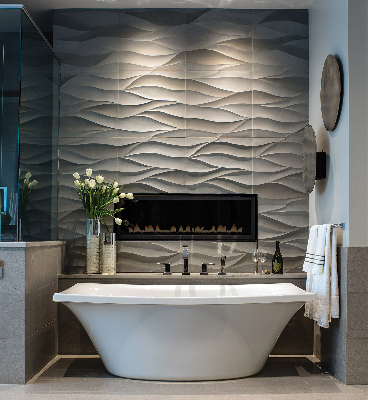
Down the hall, in the master bath, the design calls for champagne: the interior designers added a reachable shelf above the free-standing tub just for fluted drinks — a feature popular with the owners. Undulating hand-carved limestone tile and low-wattage recessed lighting make this spot so enviable that it’s become one of the top saved images on the housing-and-design website Houzz.com. As of early fall, it had been saved more than 16,000 times. Not at all a bad endorsement.
Round and Round
The floor plan and building envelope benefitted from nimble execution by Thompson Properties of Arden, the contractor that brought the details to fruition. Admittedly, building curves into structural elements can be tricky. But the builder, John Thompson, never wavered, even on the construction of two banks of windows on the view end of the house. Each bows out and is arched; framing the openings required a skilled set of craftsmen on the crew. Care and high artisanship are evident, but Thompson demurs, saying simply, “[the owners] knew what they wanted.”
Curved interior walls from the foyer to the great room also posed a challenge, this time down at trim level. A flexible resin molding was shaped around the wall base and fashioned to resemble traditional wood trim. To the untrained eye, it looks no different than wood.
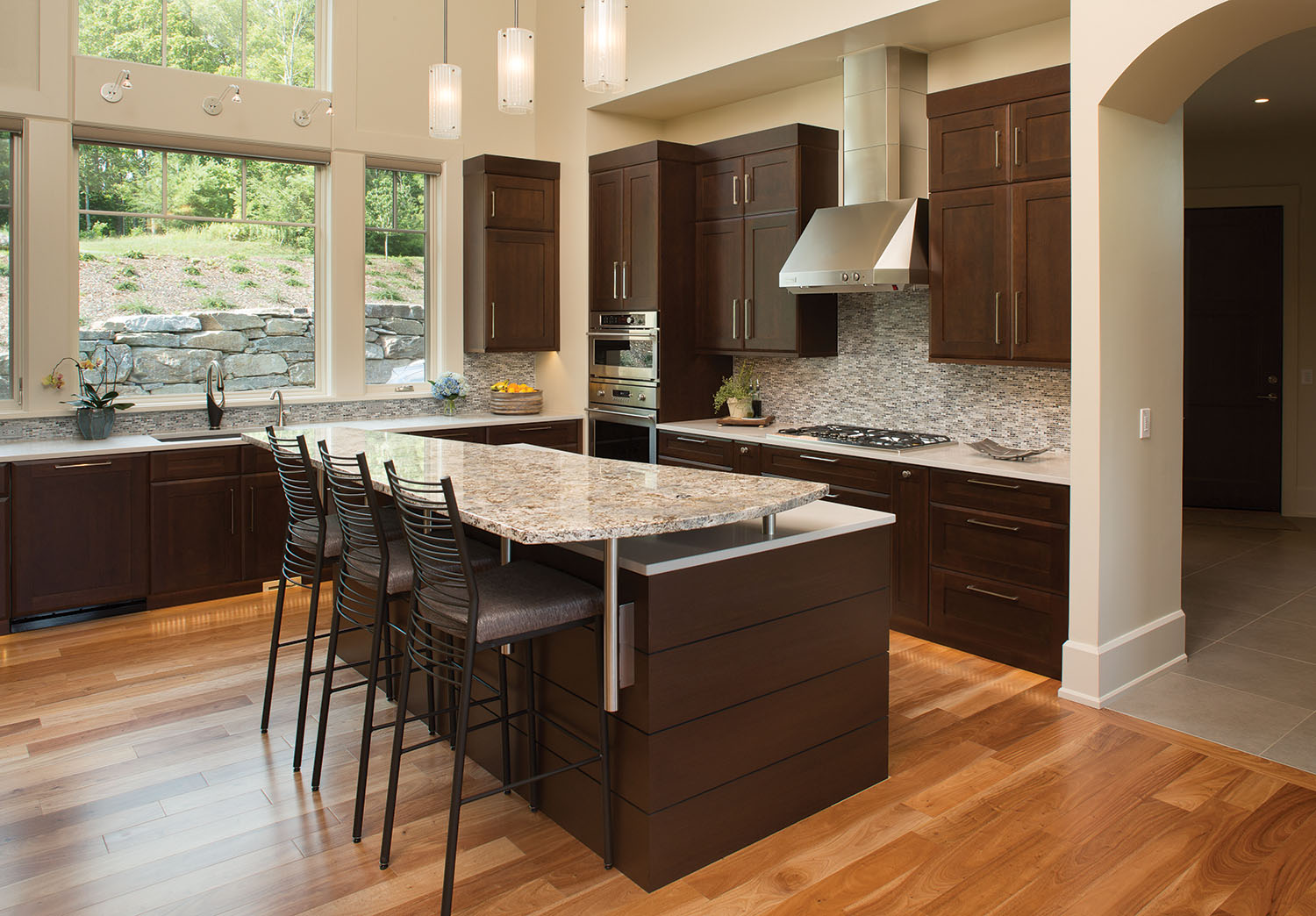
In the kitchen, a curve on the island adds a more practical element to the design. Robin asked Allard & Roberts to consider making the island countertop something more remarkable than a rectangular slab in the center of the room.
After several attempts, the firm drew what might be best described as an elevated wedge attached to the main countertop. The granite sits above the quartz top and creates a generous space for eating, laptop use, or reading the paper.
“We kept designing islands that were one height with a curved end, and Robin really wanted something more unique,” says Roberts. “She challenged us to come up with a custom design, one that incorporated her favorite curved elements, and we worked hard to deliver.”
The extra effort bore fruit. This year, the home took the local Pace Award for Best Interior Merchandising in its price category from the Asheville Home Builders Association.
